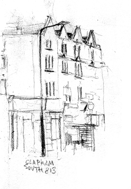
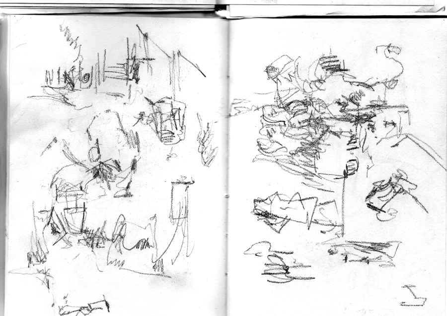
Clapham south
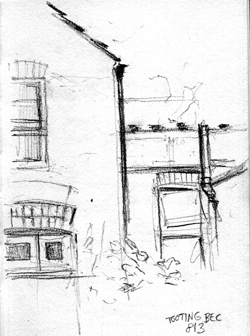
Tooting Bec
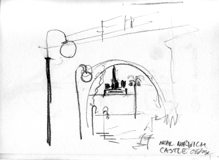
Street Norwich
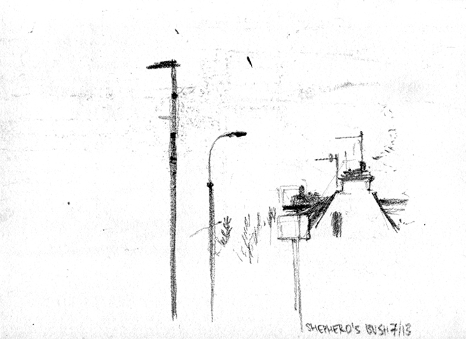
Shepherds Bush
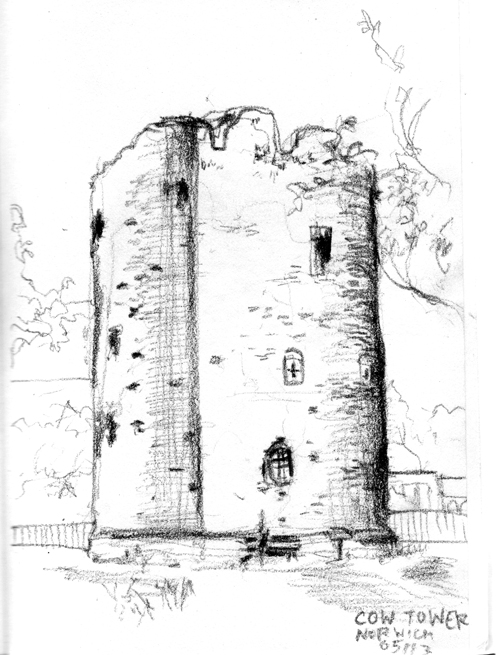
Cow Tower, Norwich
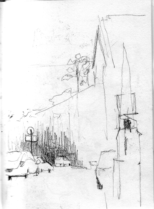
St Peter Mancroft Norwich
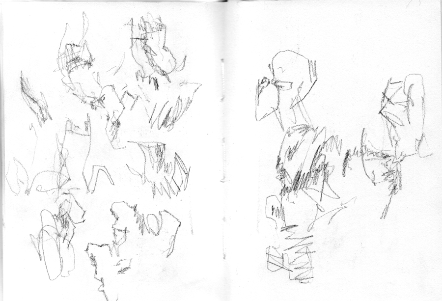
Massive Attack/Adam Curtis gig in Manchester, blind sketches
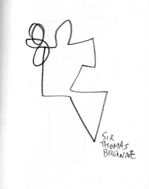
Sir Thomas Browne
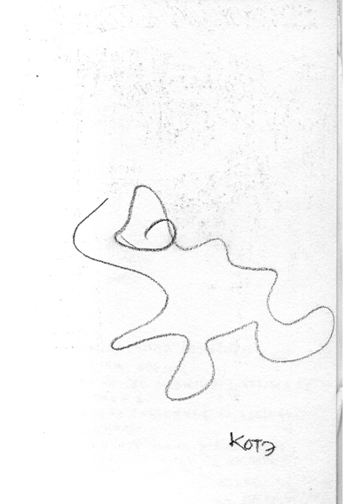
cat, 3-second drawing
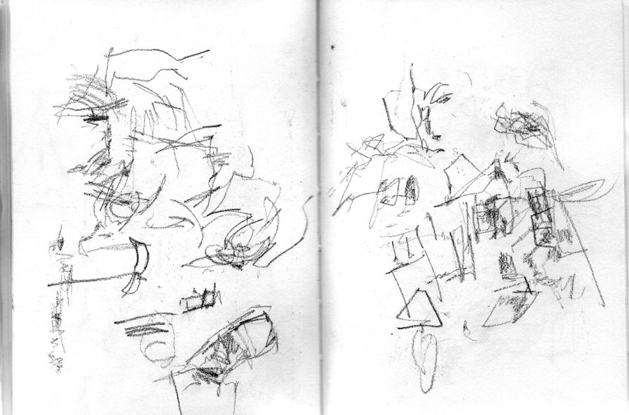
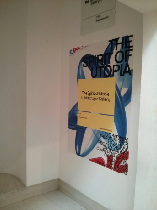
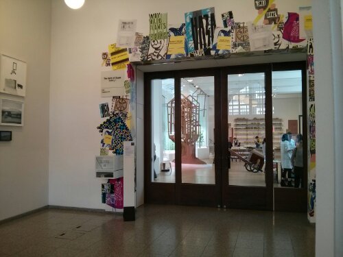
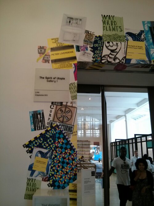
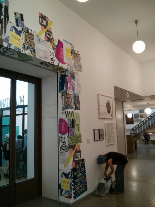
Ostengruppe posters at Whitechapel Gallery
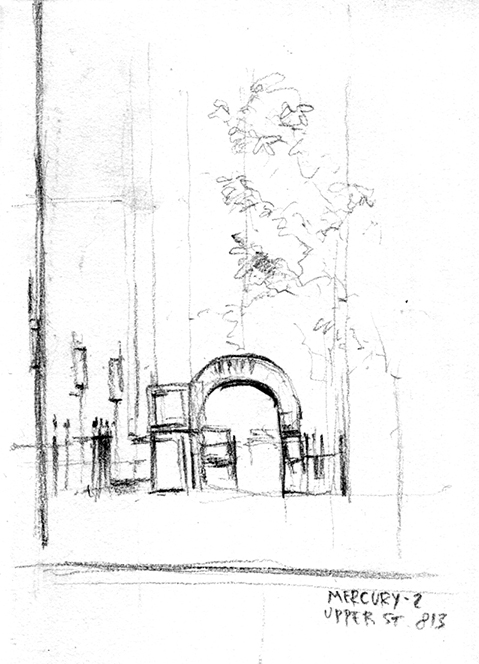
View from Mercury, Upper street
Two sketches from Norwich station
Shenfiled and a street sketch from Angel, London
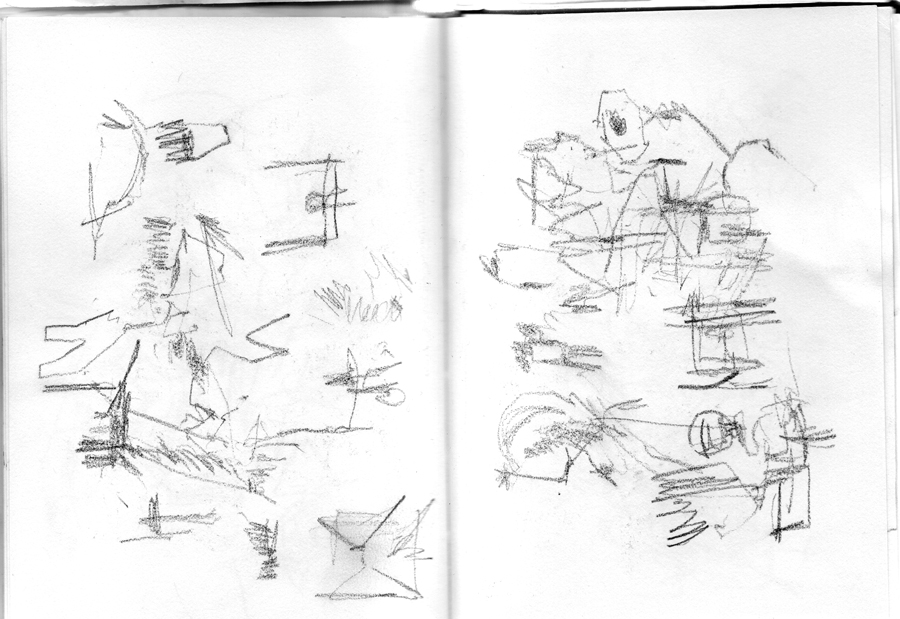
Sketch of a small squirrel
Townscape, somewhere
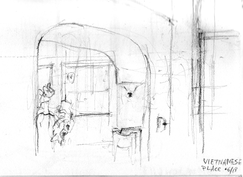
Vietnamese place on Liverpool road
Data Vis Masterclass
 Hi,
The talk was interesting and very instructive - very much appreciated, thank you very much for doing it!
This has rather to do with 'theoretical' approach to graphic arts rather than any particular talks that you do, but it seems crucial (or fun!) to define where is that distinction between the design being 'good' /'bad' (or 'successfull' / 'unsuccessful'). Been thinking about that, as it has been the matter of my day-to-day practice for years.
I agree with you here - and that's my personal belief, too - that 'design' of any set of data exists disregarding whether a person who puts it together thinks/knows about it or not.
Then, agreed again, 'function' that you mention is of a big importance to successful design, and can be used as a point of view. But in this case shouldn't we deem Gapminder as an example of 'good' design (a design that is capable of holding numerous parameters, successfully employing its graphic means)?
And of course we also have McCandless, who draws his boats on the world's flood infographic. Strictly speaking this will then be 'illustration', e.g, working with a visual constituent alone, which has nothing to do with design or 'function' - which is a process of its own, but going from here we can probably say that it cannot make the 'design' more effective - as it has nothing to do with 'function' (being rather a narrative or aethetic part). It could be used, of course, to facilitate communication, but won't be dealing with 'design' of data directly, anyways. This is, of course, if we use 'function' as the main standing point.
This is also an entirely reasonable remark that Gapminder looks like Windows 95 done by statisticians, - will we then be speaking about having to 're-skin' the interface rather than having to 're-design' it?
Hope this makes any sense - I am very glad that we have these talks which provide opportunity to take a closer look at what is it we actually do and how we do it. The field is highly interesting and rapidly developing - which makes practice extremely challenging and full of fun! (:
Regards, Zhenia
