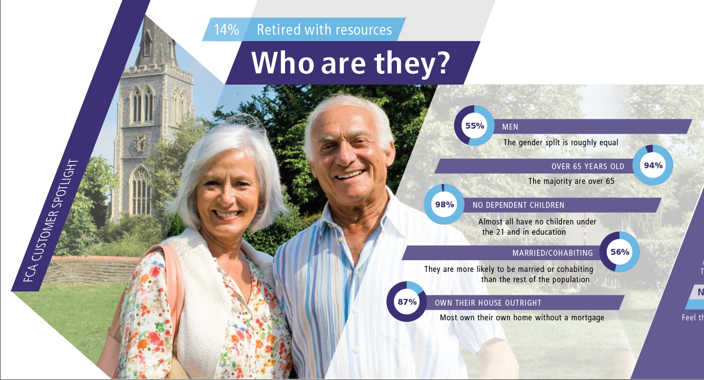
Client: Financial Conduct Authority Brief: Interface and series of infographics on the 10 social segments. Ideas:
1. Interface: Use their 21 degree slanted square as the general interface element and build a kind of slanted bar chart based on their market segmentation. Approved by client: 10 segments with pictures in them (image containers), skewed by 21 degrees and generated from a bar chart, according to percentages of those segments (in bar chart, the widths represent percentages, not the heights, so the height is consistent). Used together, they form a pattern. Roll-over state enlarges the hovered segment and gives the title of it below. Clicking on each segment takes the user to the horizontal infographic, scrollable across 3 or 4 screens (a still image).
2. Infographics: Each of them consists of 4 parts: 1) who are they (doughnut charts); 2) their attitudes (bar charts); 3) their behaviours (bar charts); 4) summary (icons + simplified bar charts).
3. Icons: slanted icons for last sections. Weather allegory for risk of detriment
Friday, Oct 4th, 2013: Updating the information It was decided to send the photography and colour for each segment for approval prior the data, as there is another specialist working on the photos. We need to get them approved so that he could be sure which photos to work with.
Data for four segments has arrived today. The problem was that now it is not consistent with the original design: instead for 5 and 5 bars on pages 2 and 3, there are now 6 and 5, or 5 and 4 etc. Have decided to put in all of the data as it has arrived and later on adjust the layout when it is approved.

