A sparkling example of how deep an icon starts to look when you place a grid behind it, although in this case, these are masterfully designed icons! Here's a link to the full presentation. #guardian #icons
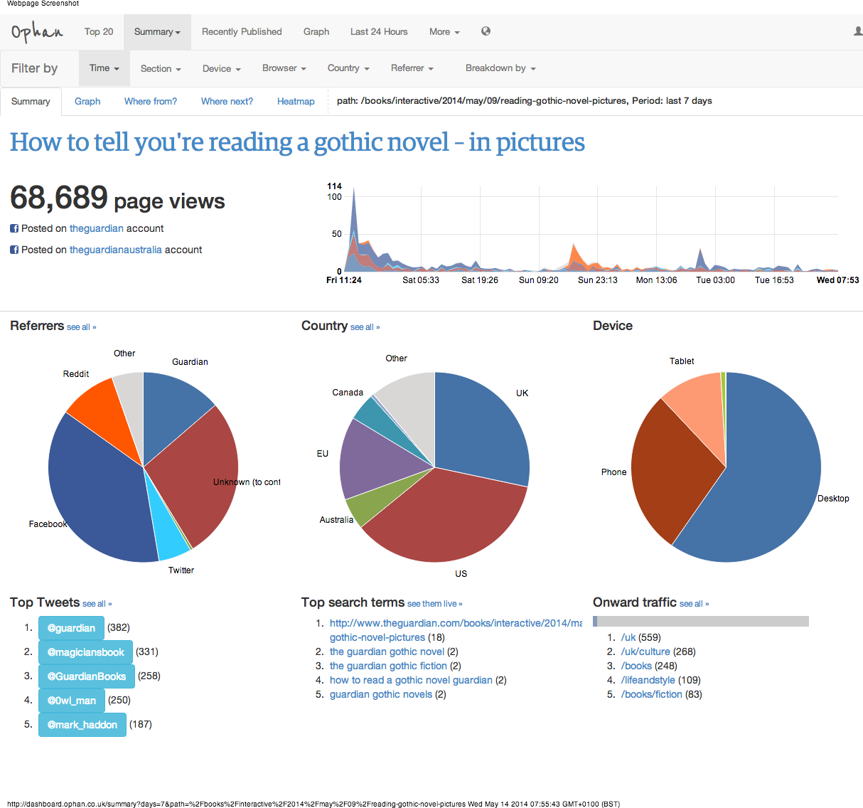
New Gothic infographic on the Guardian - statistics 5 days later
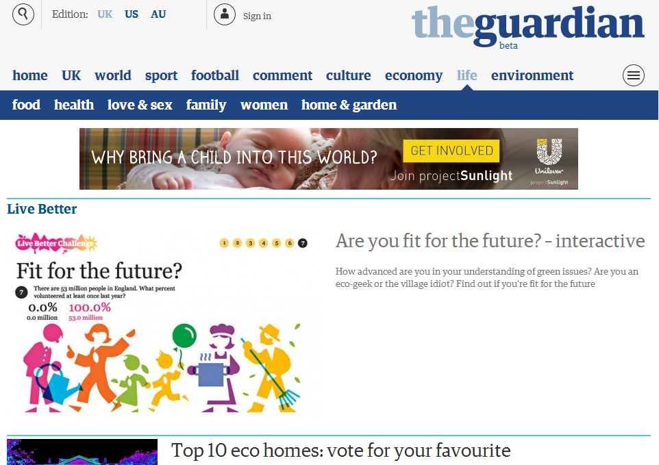
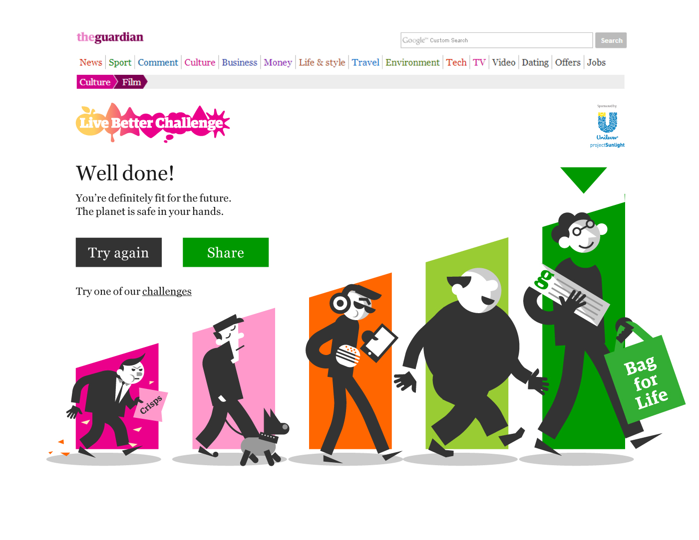
Our interactive for Live Better challenges goes live!
Our infographic on Forbes' website
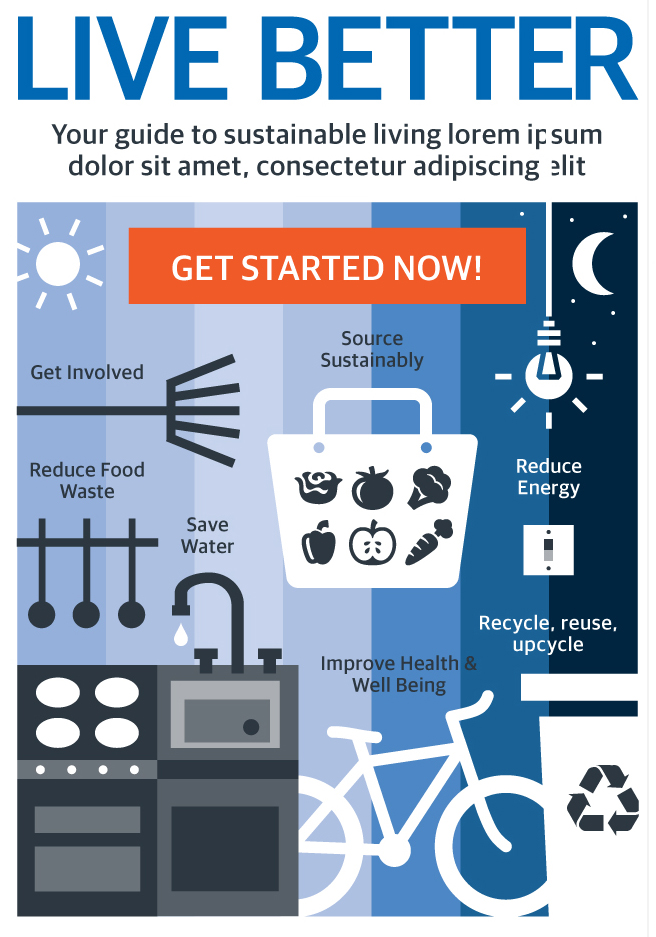
Live better!
Advertisment posters at The Guardian: 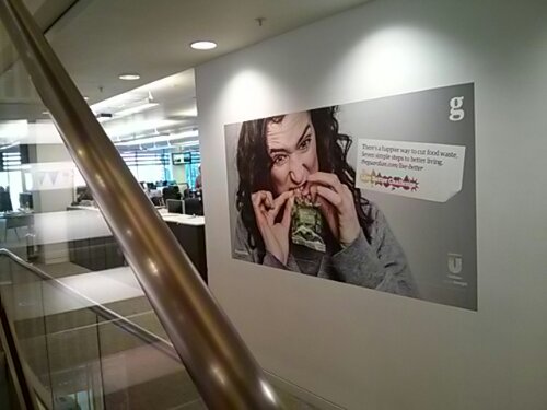
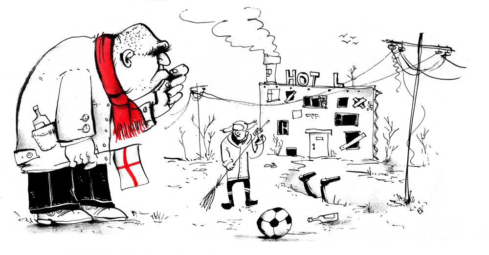
Some other illustration work done for the interactive (which is going to come live here in three weeks, watch this space!):


