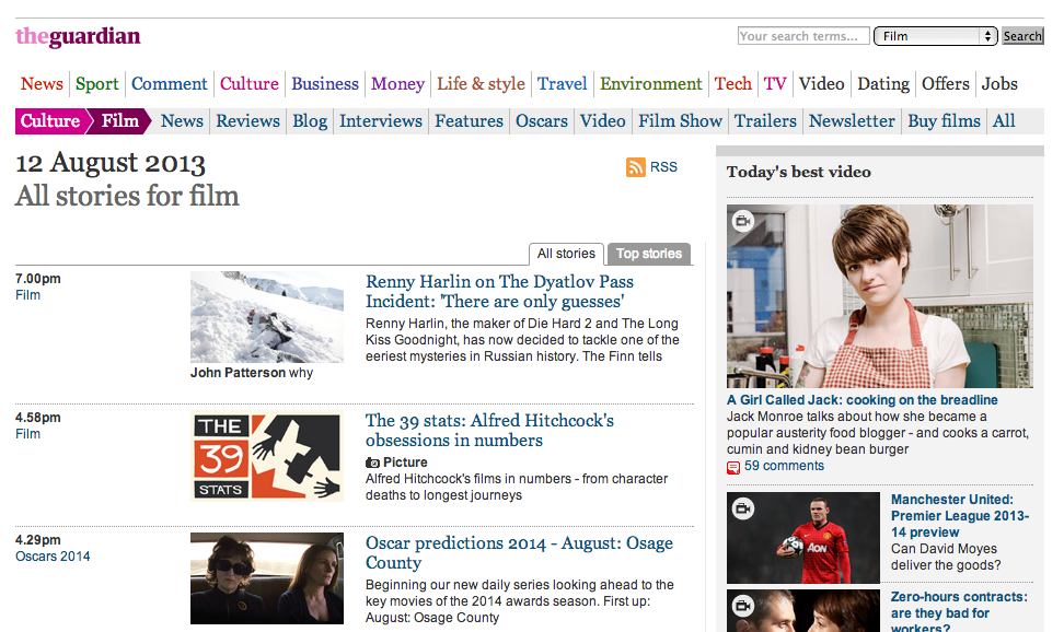
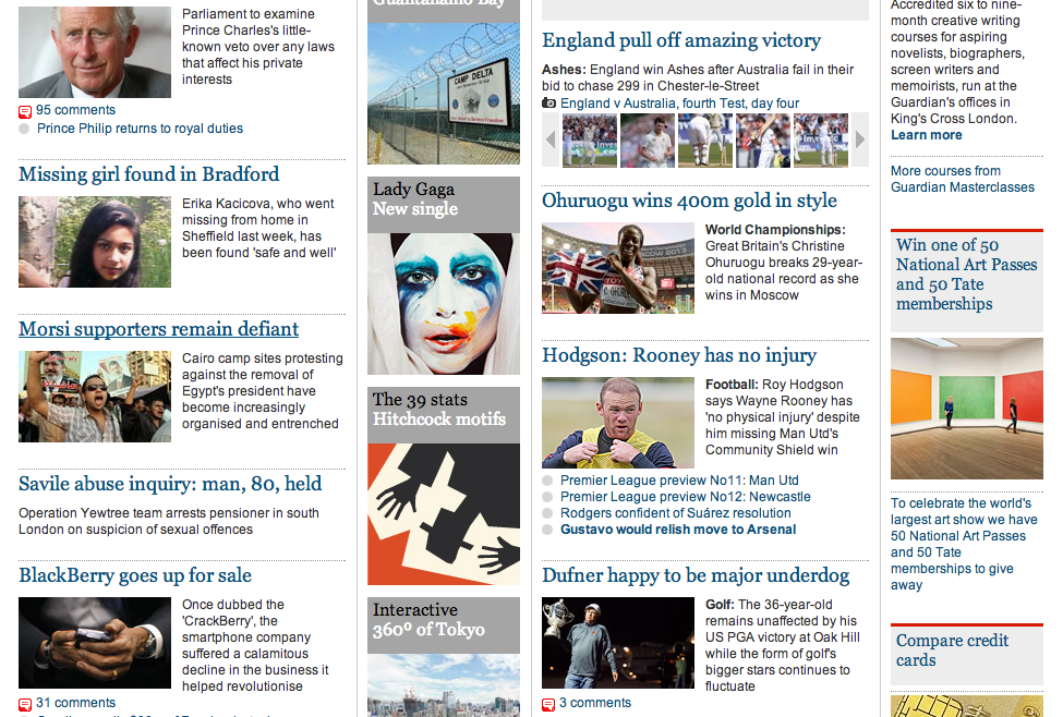
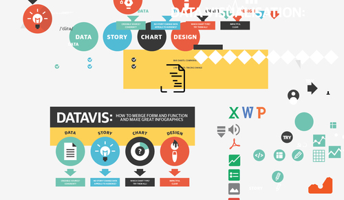
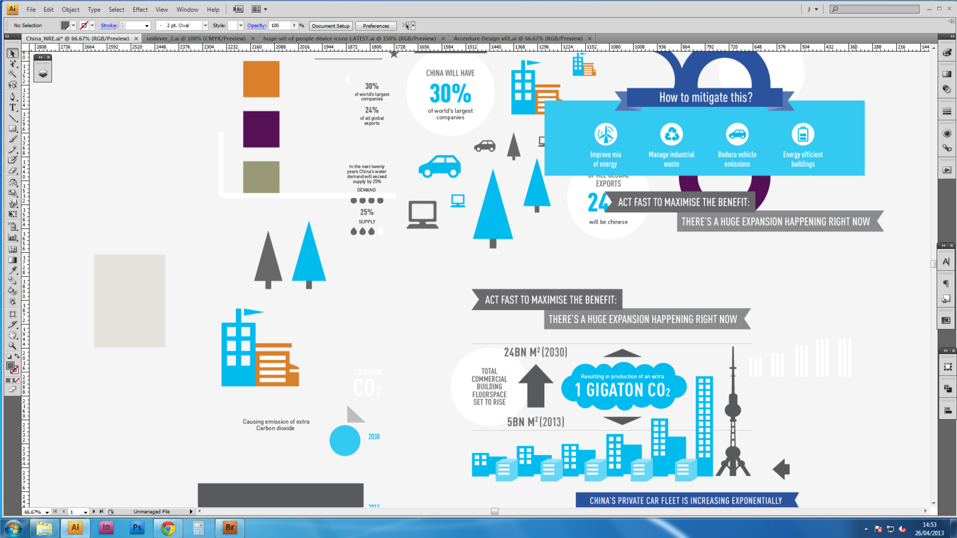
 Version 1. The initial idea is to do an infographic about how to do an infographic, and test out the 'flat iconography' aesthetics (along the lines of Google and Mailchimp's flat icon design). Initial data set consisted on four main parts: Data, Story, Chart and Design, so the start point was to select four main colours and to do a wireframe with one big introductory screen and four consequtive parts, each having its own colour, plus gray.
While working on the wireframe, I also thought it could be nice to go really big with all elements, and make the graphic viewable on the mobile screen (but I had to complete the first wireframe before going back to this - I want to try out a separate mobile version, with a really narrow artboard).
Follow-up ideas: make a supplementary (black-an-white, derived from Google's flat icons) icon set, and use consistent height/width rectangles for each of the sections.
Structure:
Part 1 - introduction (data, story, chart, design).
Parts 2-5: 1) term, class of word (noun,verb), transcription; term definition ("data is Facts and stats collected together for reference or analysis"); 2) supplementary field (e.g. 'analysing your data'): icon, 2-deck subhead, 3-4 lines of text; 3) Professionals field (e.g., Designer, Data Analyst); 4) Tools field (e.g. Microsoft Excel, Adobe Illustrator); 5) Try it! field: 1-deck heading + 2 or 3 tick-marked 2-deck slogans (e.g. "MARKING UP� A SPREADSHEET", "SKETCHING CHARTS�WITH KEY DATA").
Next step: mobile version on a narrow artboard, especially intro screen with big header and four icons.
